outer center
A data-driven UX overhaul for a sportswear e-commerce platform.
00
problem
Users abandon online sportswear purchases due to forced registrations, complex checkout flows, and unclear return policies. This creates friction, lowering conversion rates and damaging brand trust.
solution
A complete UX overhaul based on user research. I redesigned the platform with guest checkout, simplified payment flows, and transparent return policies to ensure a seamless, high-converting shopping experience.
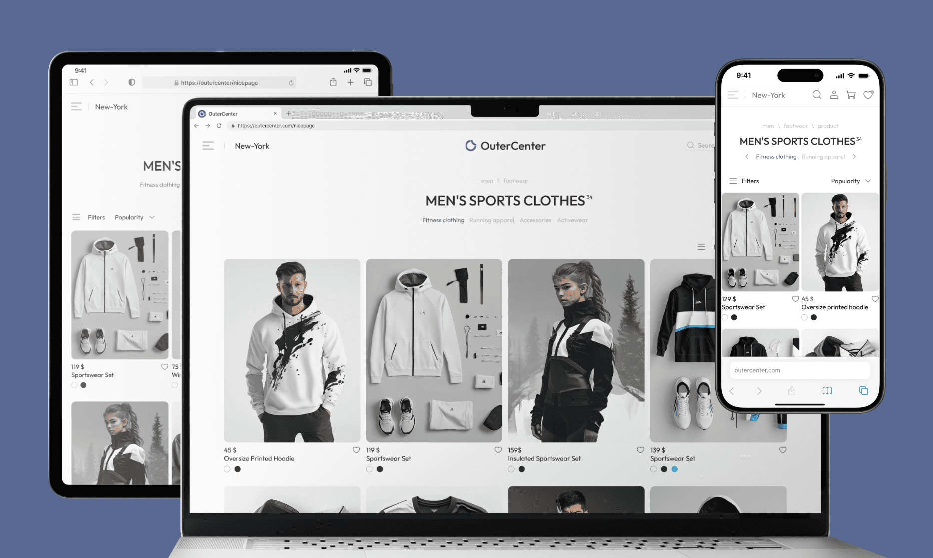
Outer Center - e-commerce platform for sportswear. The goal wasn't just a visual refresh, but a complete UX overhaul based on real user data. I started by digging into the core pains of online shopping to boost conversion and reduce cart abandonment.
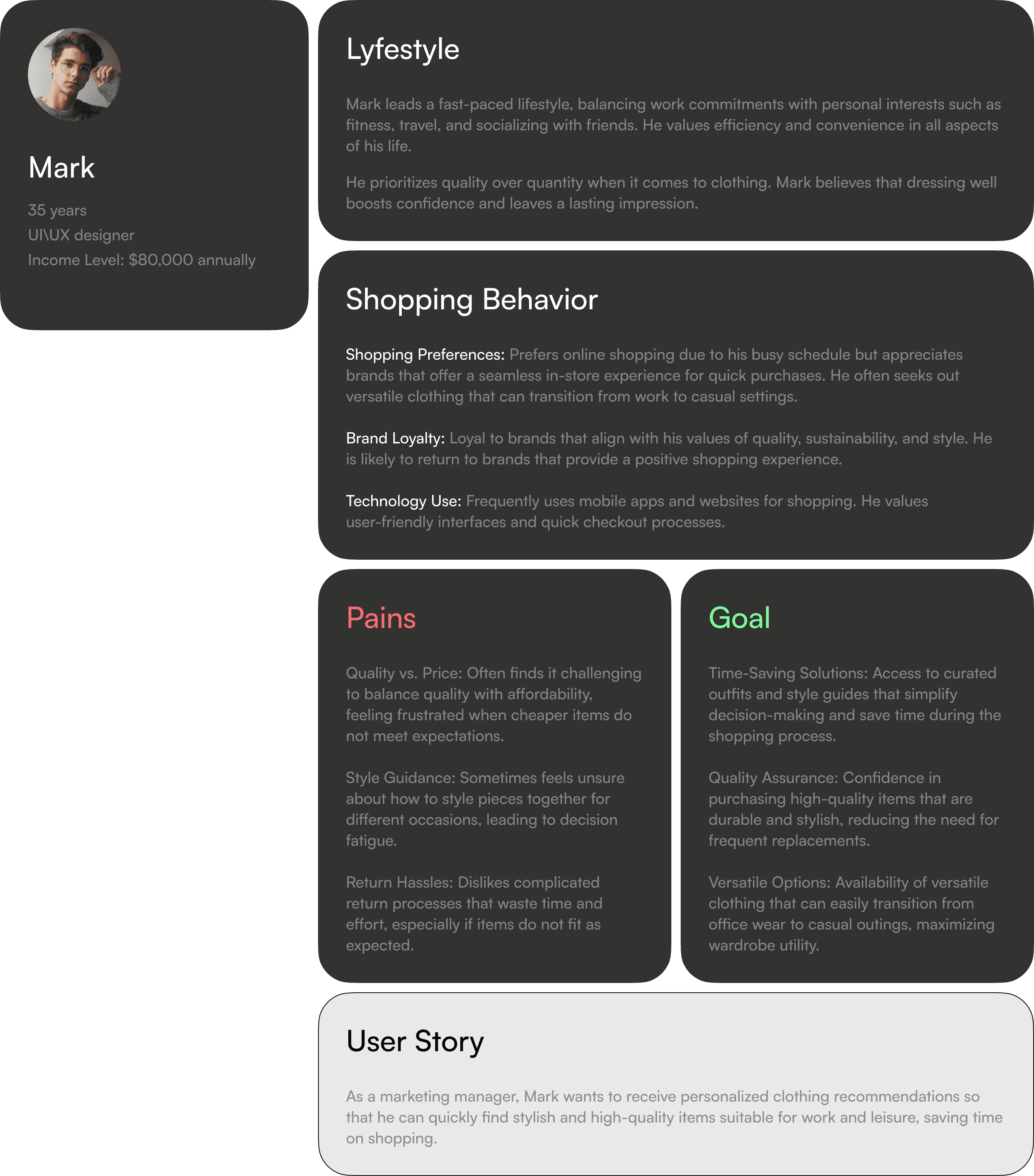
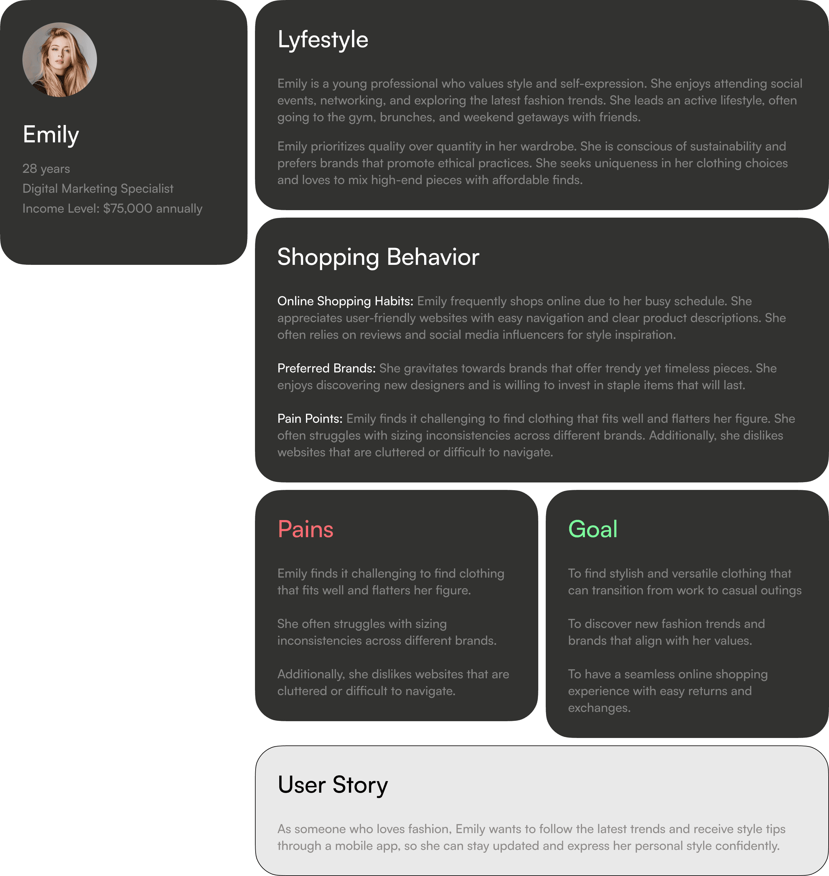
User Research & Personas
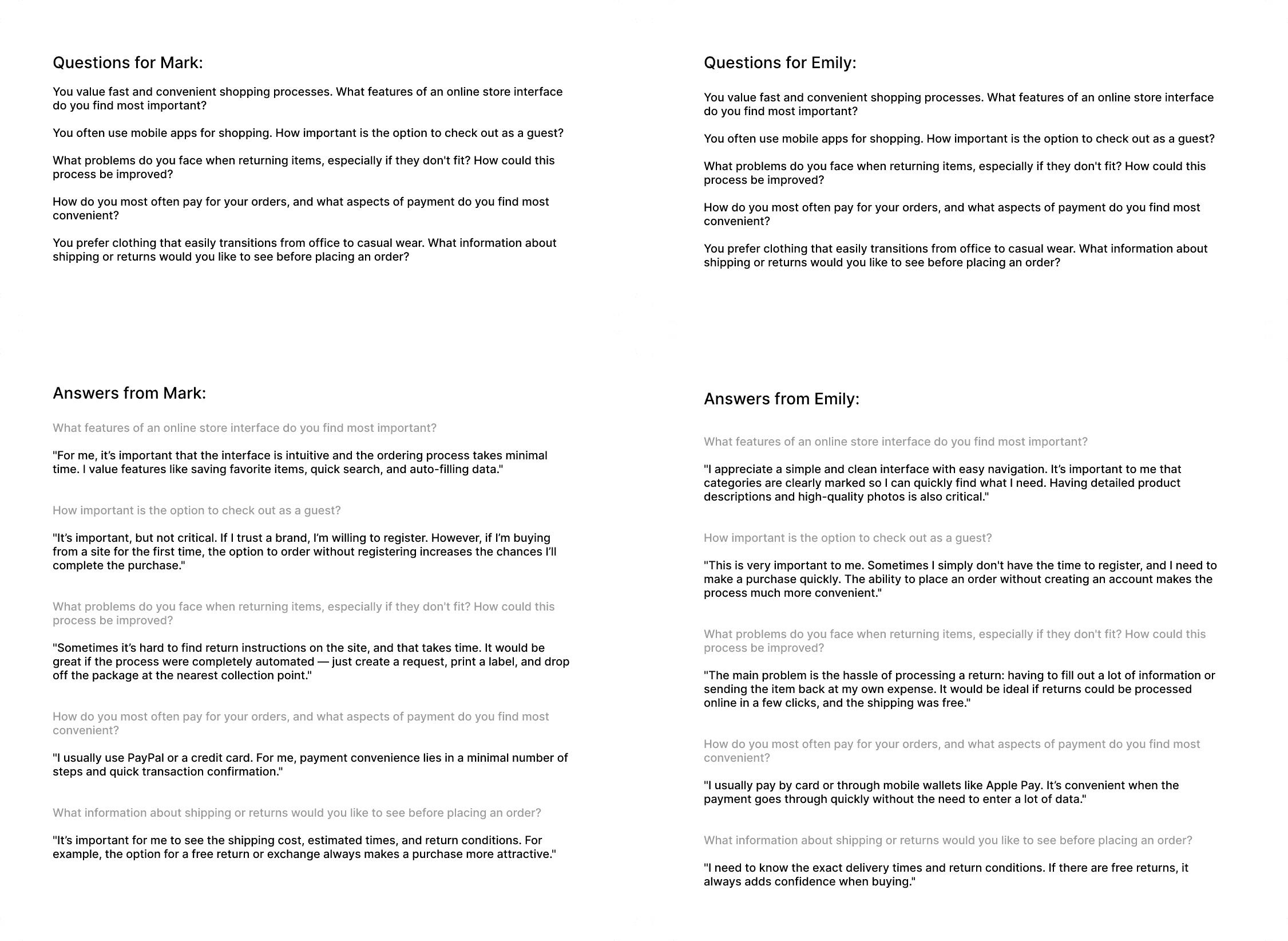
Before sketching any wireframes, I conducted in-depth interviews. Meet our core personas: Mark (values speed and versatile style) and Emily (focuses on fit, trends, and easy returns). Understanding their shopping behavior and frustrations shaped the entire logic of the new interface.
Deep Dive: The Interviews
I asked direct questions about checkout friction, delivery preferences, and return hassles. The insights were clear: users hate forced registration, get frustrated by complex return policies, and demand seamless payment methods.
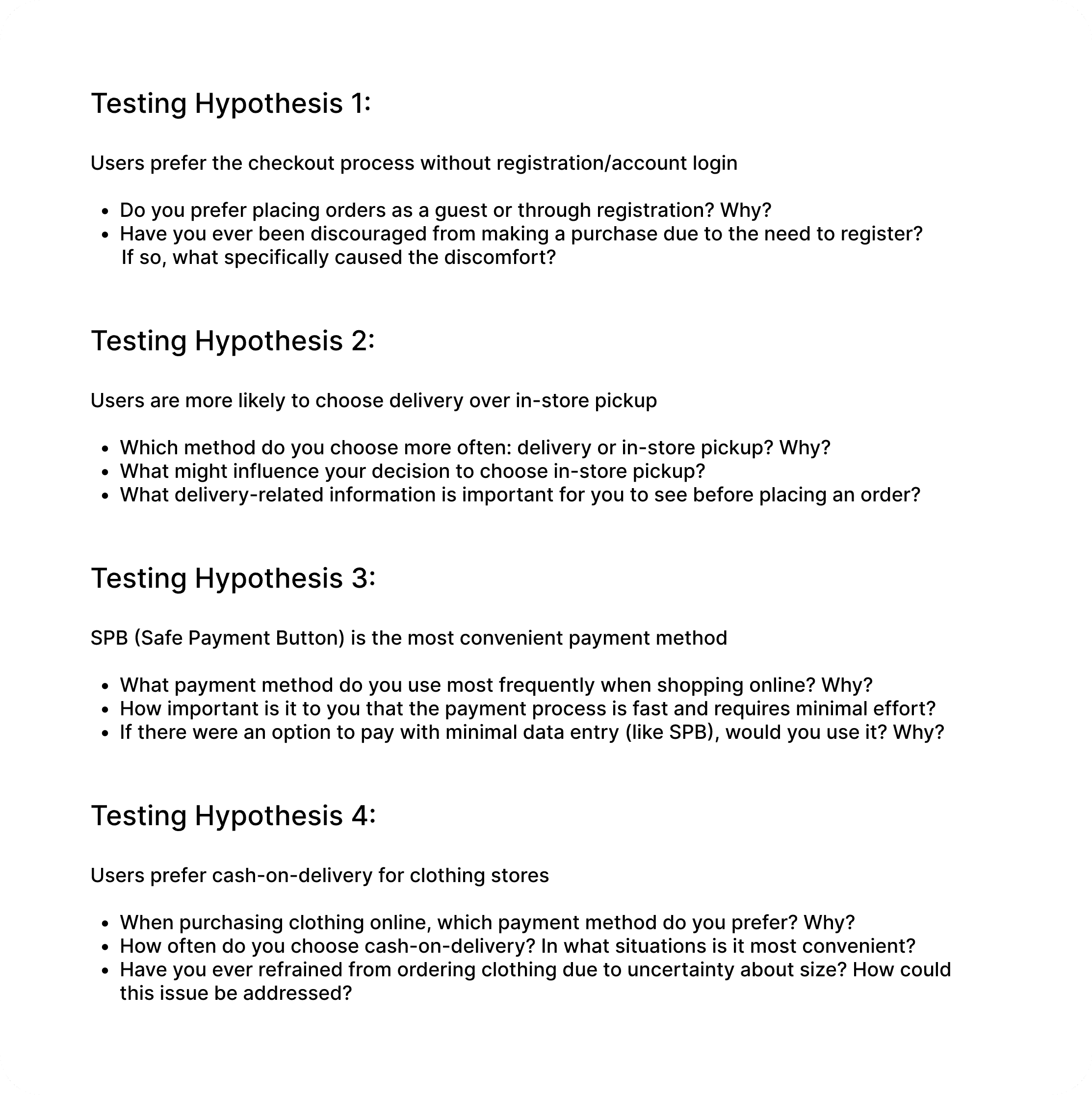
Formulating Hypotheses
Based on the interviews, I formulated four key hypotheses to test. From guest checkout viability to the adoption of Safe Payment Buttons (SPB, Russian safe payment system). This data-driven approach ensured every UI decision was backed by user validation, not just aesthetics.
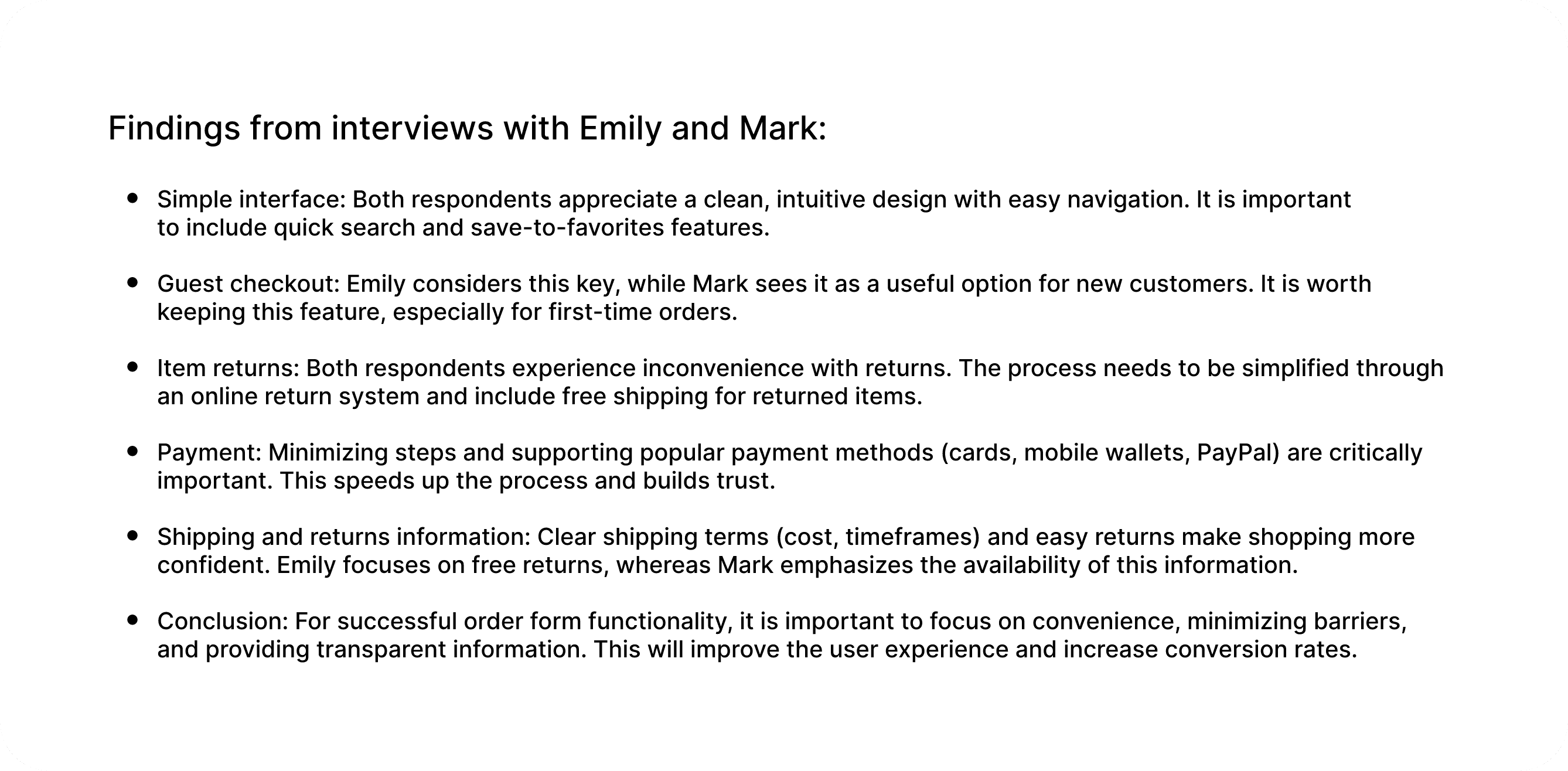
Research Conclusions
The research dictated the final requirements: a clean interface with quick search, guest checkout options, transparent delivery/return info, and minimal-step payment flows.
Architecture & Competitor Analysis
Before sketching the wireframes, I analyzed industry leaders to see how top sportswear brands handle navigation, filters, and product details. Combining these best practices with our user research, I built the foundational wireframes for the core flows: the catalog and the product page. This step ensured the structure was logical, frictionless, and conversion-ready before any visual styling was applied.
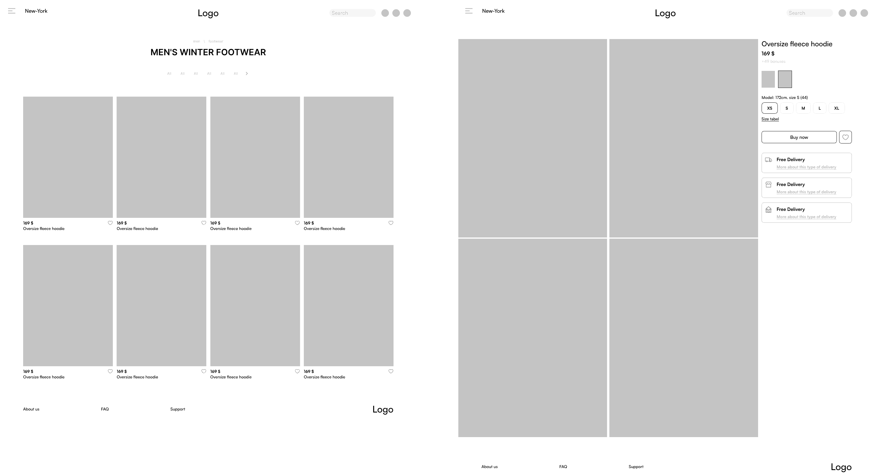
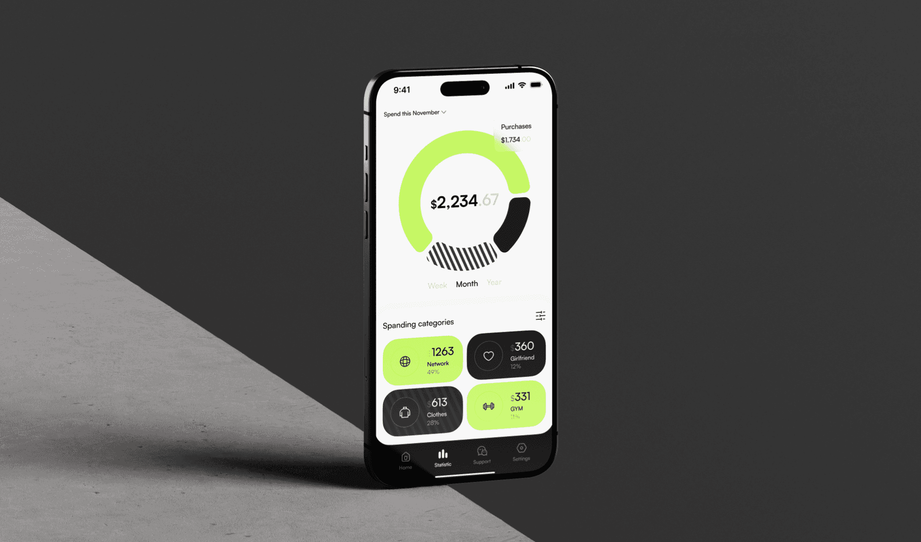
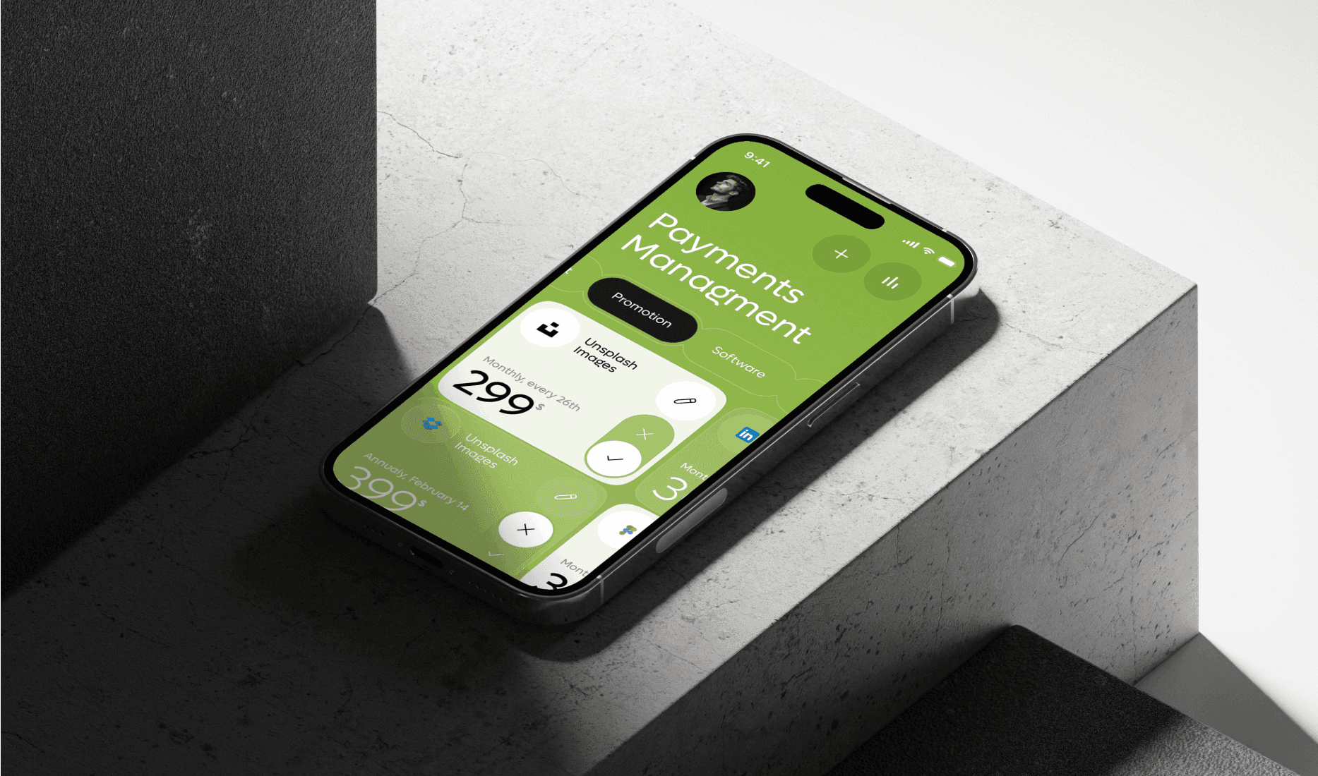
The Solution: Visual Flow
Translating research into reality. Here is how the validated hypotheses shaped the final, high-converting UI.
year
2025
timeframe
24 days
tools
Figma, Adobe Tools
category
UI/UX
01

02

03

see also